TYPE REACTORSYSTEM ONLINE
A letter becomes a system. The system becomes an experience.
Website design and development where typography, layout, motion and code share one job: make the business clear, distinctive and easy to contact.
The idea reactor
One visual signal moves through the entire website: from the first letter to the grid, the interaction and the finished business flow.
-
Typography in your own voice
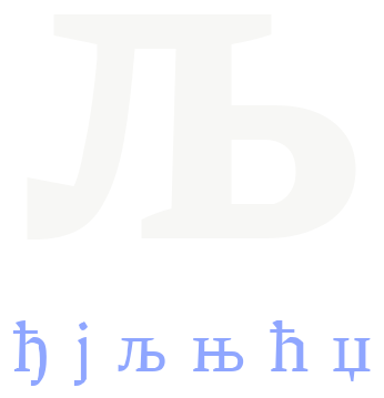
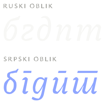
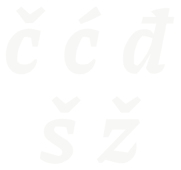
The choice is more than a “nice font”: tone, readability, Serbian characters and behaviour across screens all matter.
-
A layout that directs attention
Hierarchy, rhythm and space give each message the right position without relying on template sections.
-
Motion that explains change
Scroll connects two meaningful states: before and after, material and result, question and decision.
-
Colour that passes the test
The palette starts with identity, while every text and background pair remains readable.
-
A mark that survives every scale
A header logo, favicon, share image and app icon are not the same file reduced four times.
-
3D only when it carries the idea
A scene stays when it explains something and a phone can support it; otherwise a lighter method takes its place.
Selected work
Projects where design solved a specific problem, from a multilingual ballet school to an industrial product catalogue.
-
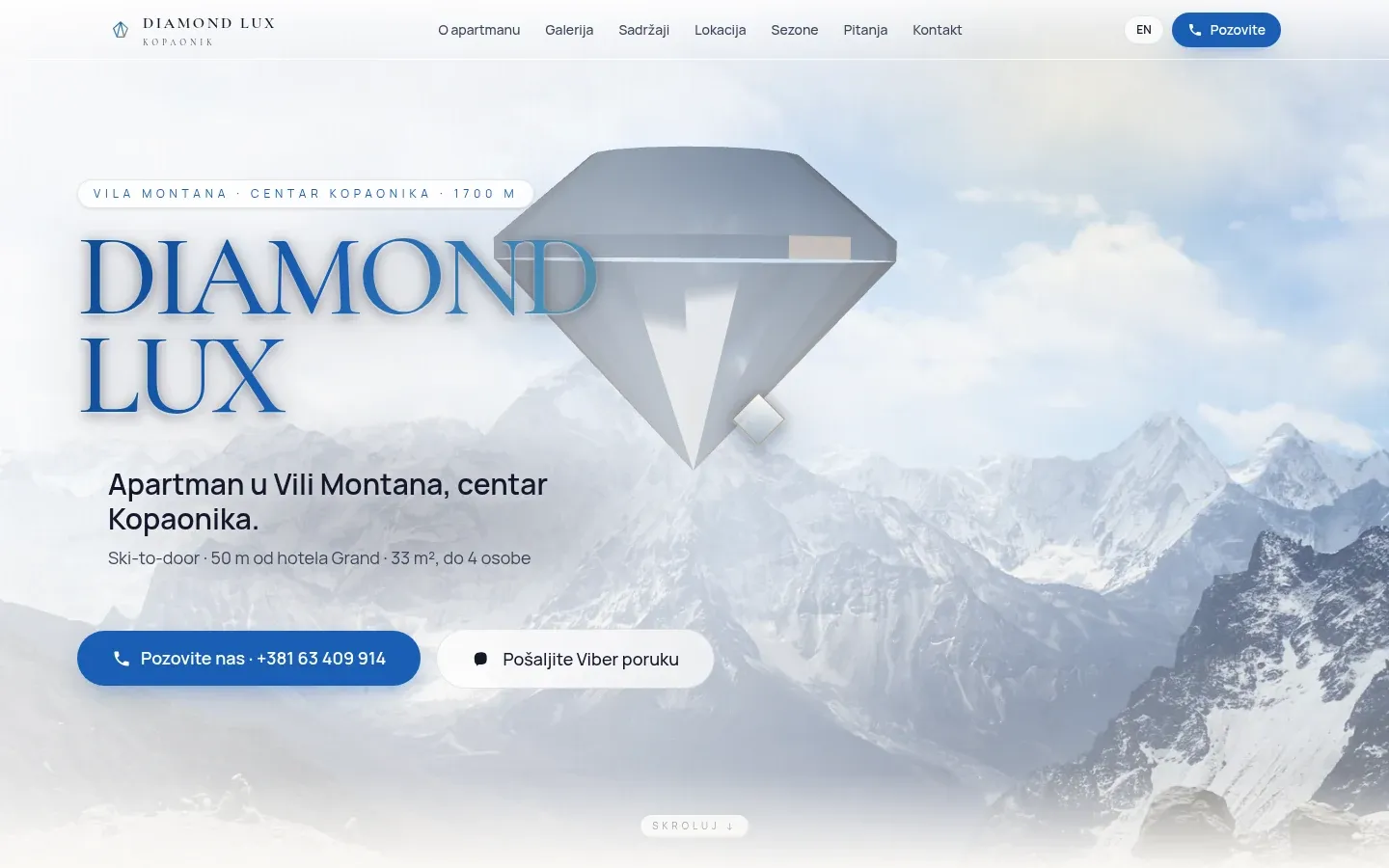
On desktop, a WebGL diamond follows the page scroll, deliberately without a post-processed image, the most expensive part of the scene.
-
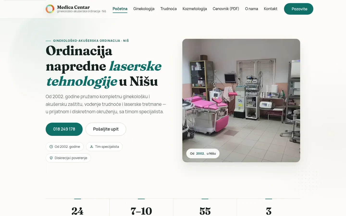
A clinic website could not sound like a shop. A calm tone shaped the layout and typography, while the palette was reduced to a single accent.
-

Fraunces for headings and Manrope for text, both self-hosted, with light and dark themes that switch without flashing.
-
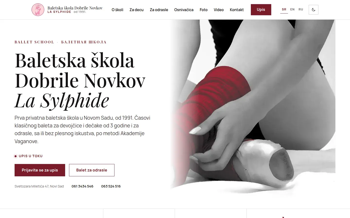
A ballet school in Serbian, English and Russian. The fonts are split into three subsets, so the Russian page has its letters while the Serbian page does not load Cyrillic it does not need.
-
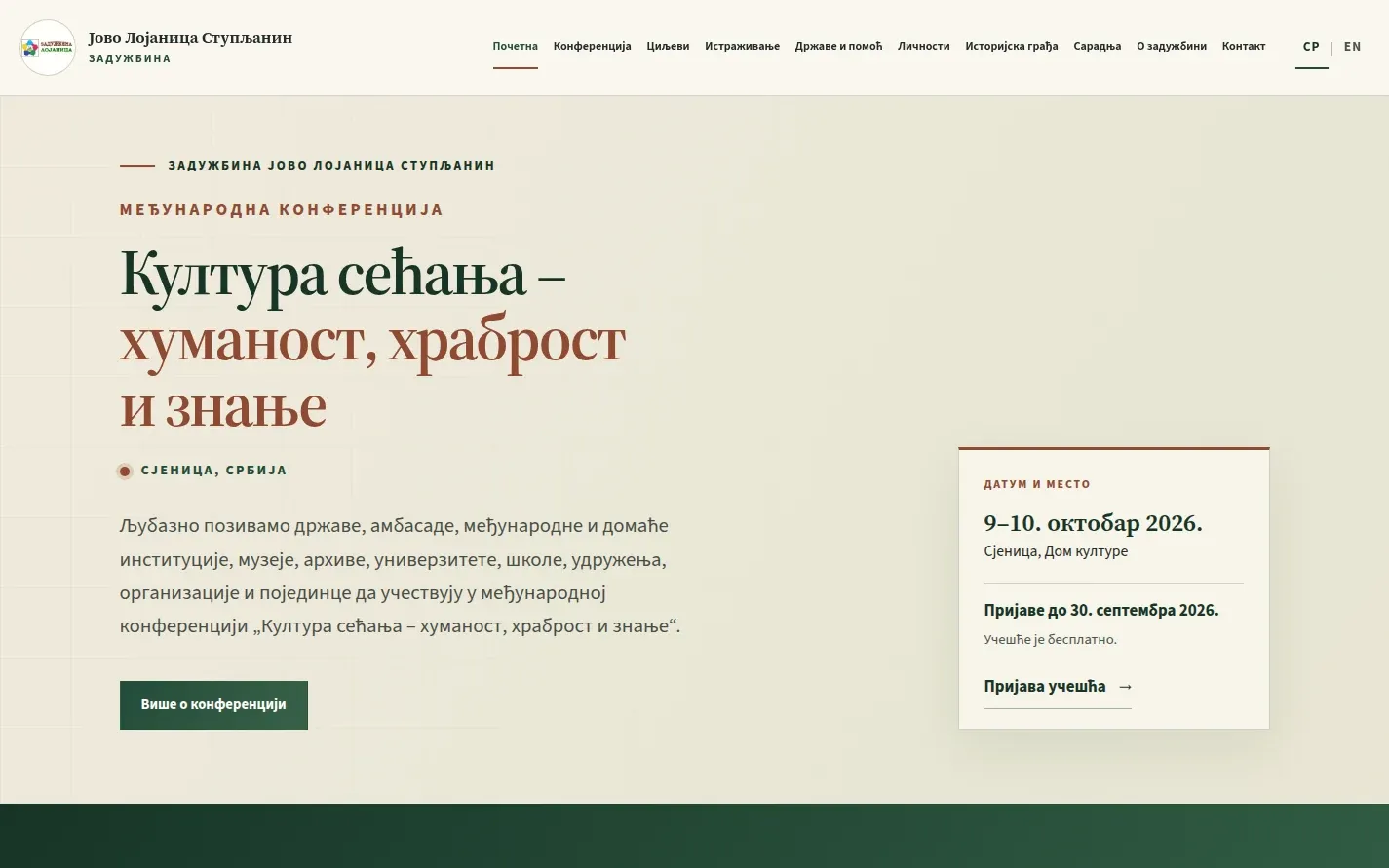
A website in Serbian Cyrillic. The language switch opens an English translation when one exists.
-
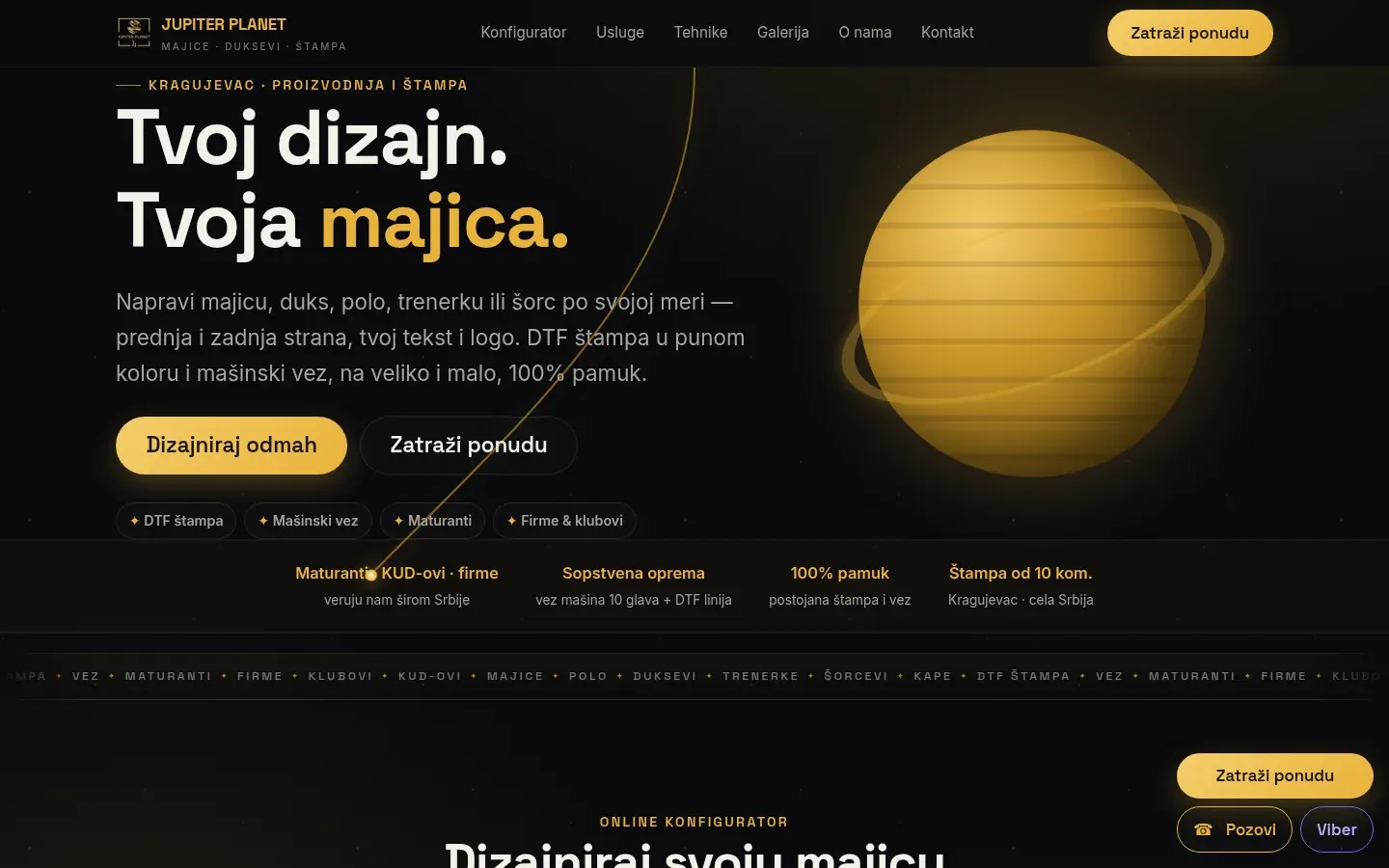
The configurator selects a shirt colour from a palette, while one photograph produces every shade through multiply blending.
-
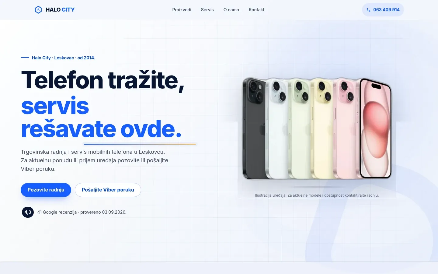
The WebGL crystal scene was removed in the second version, in September 2026, because the site needed to work on a phone with a slow connection.


From signal to live site
- Listen. What the business does, who it serves and what the visitor needs to do.
- Build the system. Content, type, colour, grid and motion receive clear roles.
- Work in the browser. You follow the real website on desktop and mobile while it is being built.
- Measure and repair. Keyboard, contrast, performance, no-JavaScript content and reduced motion are tested.
- Launch. Domain, forms, redirects and search controls are verified on the live version.
Where a polished impression often breaks
-
A missing character
When a font lacks a local character, the browser inserts another typeface into the word. Character coverage is tested rather than assumed.
-
Motion that hides the message
Content remains visible in HTML before animation. JavaScript improves the sequence without holding the message hostage.
-
A scene that only works on a strong laptop
The effect has a lighter path, pauses outside the viewport and respects reduced motion. The idea remains on mobile without needless weight.

Who runs the reactor
D. Svilenković handles design and development directly, from the first structure and visual system to QA and launch.